Case Study · Personal Project
Green Helios
A financial management platform for short-term rental hosts on Airbnb and Booking.com — designed and built end-to-end so hosts can see profitability per property, not only revenue.
- Role
- Product Designer
- Project
- Personal Project
- Focus
- Research • Product Strategy • End-to-End Design
- Availability
- Personal Project
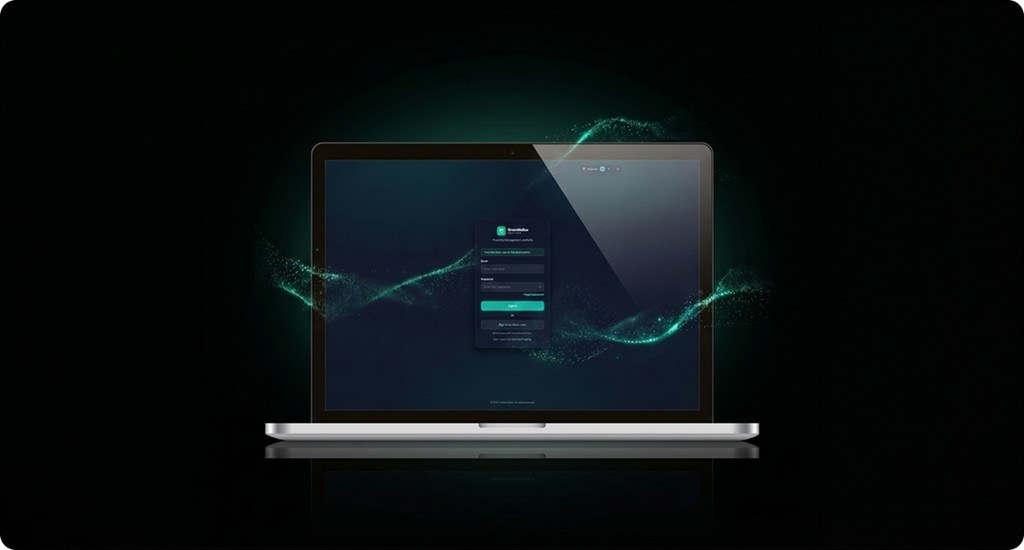
Project Preview
Selected product visuals are intentionally limited in the public portfolio.
Additional materials and walkthroughs are available during interviews.
10
Screens designed end-to-end
2
Technical architectures built
1
Design and implementation ownership
Context
Why this product exists
Multi-property hosts still manage finances across platform dashboards, invoices and spreadsheets. As portfolios grow, complexity outpaces the tools they use.
Green Helios aggregates income and expenses so hosts can judge portfolio performance as a business — not as disconnected booking feeds.
Short-term rentals are operationally mature; host tooling is still fragmented. Hosts need a clear view of profitability before they keep, sell or expand.
Users
A private individual hosting 2–10 properties on short-term rental platforms. Not a financial professional — needs clarity, not complexity.
Kostas, 38
Jobs to be done
- See total income vs expenses at a glance
- Know which property is most profitable
- Track maintenance costs per property
- Understand occupancy rates over time
- Export financial reports for tax purposes
When I close the month and decide whether to keep or sell a property, I want to see net profit immediately — so I decide on data, not on a feeling.
Constraints
On a team academic project, I owned product definition and implementation. That dual role shaped scope: every interface had to be buildable without a dedicated QA or design-ops team.
- Time & ownership — Design and two full implementations had to fit a fixed academic window.
- Technology — Version 1: Spring Boot, Thymeleaf, Bootstrap. Version 2: Next.js, React, Tailwind.
- Platform — Desktop web first; mobile was out of primary scope.
- Security — Version 1 required Spring Security foundations, including 2FA and role-based access.
Problem
The challenge
Private hosts on Airbnb and Booking.com lack a unified view of their finances. Income arrives from multiple platforms; expenses sit in invoices and notes. There is no single place to see profitability per property.
Green Helios aggregates that activity so hosts can make keep, sell or expand decisions from one place.
Research
What shaped the product
Research combined informal interviews with hosts, competitive review of generic finance and property tools, and heuristic evaluation of early Figma wireframes.
The strongest signal was not a request for richer analytics. Hosts already had data — they lacked a reliable answer to whether a property was profitable. Spreadsheet workarounds delayed decisions.
Insight
Hosts wanted fewer charts and a clearer verdict — one answer before ten graphs.
Success criteria
- Business signal — Hosts with 3+ properties can evaluate keep/sell/expand decisions without rebuilding spreadsheets each month.
- UX metric — Time to identify net profit for a selected property should drop from multi-minute spreadsheet work toward under 30 seconds in the dashboard.
- Delivery metric — Ship a complete primary journey (auth → dashboard → properties → reports) in both architectures.
Solution
Design approach and decisions
Work moved from user needs through information architecture and Figma wireframes to high-fidelity UI, then full implementation in two stacks.
Design principles
Information architecture
Persistent sidebar: Dashboard, Profile, Properties, Reports, Notifications, Settings and Help Center. The primary journey prioritizes portfolio health, then property detail, then reporting.
Early exploration treated properties as isolated tabs. That was rejected — multi-listing hosts need comparison, not isolation. Out of scope for v1: mobile-first layouts, automated bank imports and marketplace booking management.
Key design decisions
Decision 1
Lead with net position, not a property showcase
Decision
Version 2 opens on KPI cards (income, expenses, balance, transactions) and charts — not a property marketing banner.
Alternatives considered
- Version 1 pattern: marketing-led property card above finances
- Chart-first layout with KPIs below the fold
Trade-off
Less decorative presence; faster orientation to the host’s primary question.
Outcome
The product reads as a finance tool, not a listing portal.
Decision 2
Modal entry for create flows in Version 2
Decision
New property and income/expense forms use centered modals in Version 2, replacing Version 1’s right-side drawers for primary create tasks.
Alternatives considered
- Persistent side drawers (Version 1)
- Full-page forms that leave the list context entirely
Trade-off
Modals focus attention but hide more of the underlying list; drawers preserve context but felt heavier for short forms.
Outcome
Create tasks became shorter and more intentional; list scanning remained the default state.
Decision 3
Build the same product twice — on purpose
Decision
Implement Green Helios in Spring Boot/Thymeleaf and again in Next.js/React to learn how architecture constrains UX fidelity.
Alternatives considered
- Ship a single stack and treat the other as mockups only
- Design for the lowest-common-denominator (Bootstrap only)
Trade-off
Doubled implementation cost; gained concrete evidence of where design systems survive engineering constraints.
Outcome
Bootstrap limited layout precision; React allowed closer fidelity to the Figma system — useful context for working with engineering.
Visual language
A semantic color system: teal for interactive elements, green for income, red for expenses, amber for warnings. Status is never color alone — labels travel with it.
Product tokens (Green Helios — not portfolio chrome)
Accessibility
- Contrast (WCAG 1.4.3) — Body text targets 4.5:1; status colors pair with labels, not color alone.
- Semantics — Forms use visible labels; status badges include text (Income / Expense / Warning).
- Keyboard — Primary navigation and modal/drawer flows designed for keyboard reachability.
- Error prevention — Transaction forms require property, category, amount, and date before submit.
Technical implementation
The same product was implemented twice — to see how architecture affects design flexibility, performance and UX decisions.
Version 1 — Spring Boot + Thymeleaf
Server-side rendering with Spring Security foundations, role-based access, single-session enforcement and JUnit 5 coverage.
Version 2 — Next.js + React
Component-based architecture with richer interactions, a custom design system and closer fidelity to Figma.
Key insight
Bootstrap limited layout flexibility; React allowed closer implementation of the design system. Architecture shapes what UX can deliver.
What shipped
- 10 screens designed end-to-end covering auth, dashboard, profile, properties, reports, settings, and help
- 2 complete technical architectures implementing the same product definition
- A documented shift from marketing-led dashboard patterns to finance-first hierarchy
- Working security foundations in Version 1 and richer interaction fidelity in Version 2
Reflection
What I would change
Version 1 leaned too hard on a visually rich dashboard — including property marketing patterns that competed with financial clarity. Version 2 corrected that: start from the user’s question, not from Bootstrap patterns.
Restarting today, I would lock success metrics and the primary decision (net profit) before high-fidelity work, and prototype create flows as modals earlier instead of learning the drawer trade-off mid-implementation.
Building twice was costly and useful. It improved how I collaborate with engineering — every spacing and layout choice had a real implementation cost.
Next priority: seasonality-aware profitability forecasting, so hosts see not only “now” but what is coming — a need that surfaced while defining tax-export and occupancy goals.